Skip to content

🎉 Material UI v6 is out now! Check out the announcement blog post →

Design Kits

Material UI
in your favorite
design tool

Pick your favorite design tool to enjoy and use Material UI components. Boost consistency and facilitate communication when working with developers.

Spotify logoSpotify logo
Amazon logoAmazon logo
Apple logoApple logo
Netflix logo
X logo
Salesforce logo

The world's best product teams trust MUI to deliver an unrivaled experience for both developers and users.


Collaboration

Be more efficient designing and developing with the same library

For designers

Save time getting the Material UI components all setup, leveraging the latest features from your favorite design tool.

For product managers

Quickly put together ideas and high-fidelity mockups/prototypes using components from your actual product.

For developers

Effortlessly communicate with designers using the same language around the Material UI components props and variants.


Design Kits

Enhance your design workflow

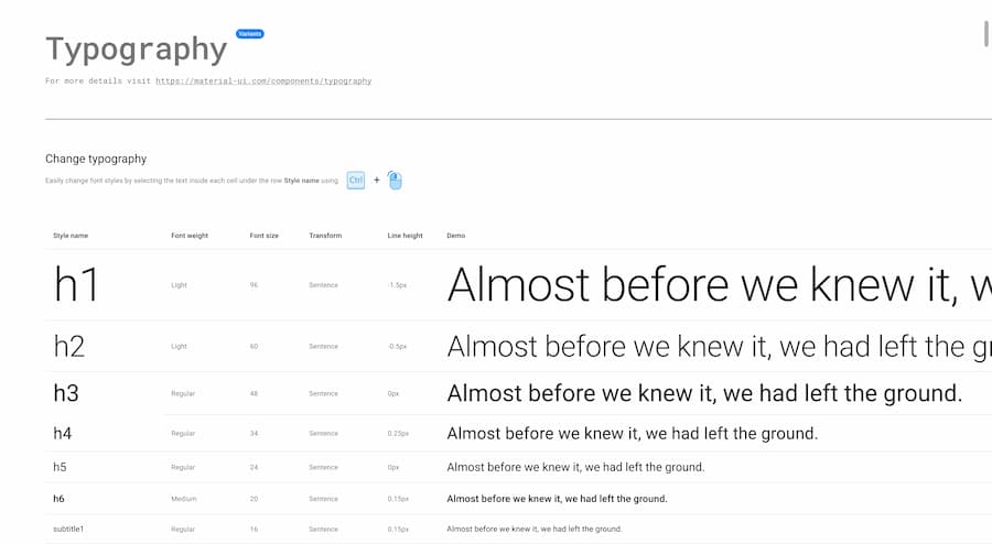
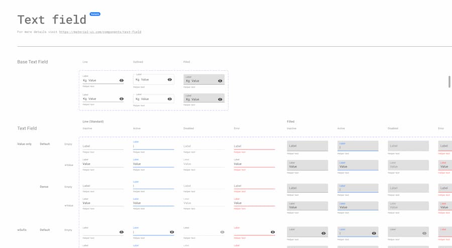
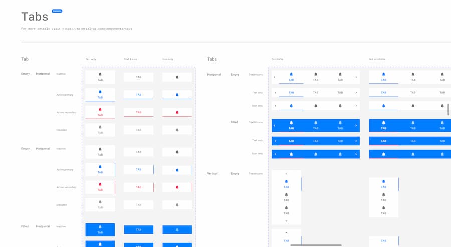
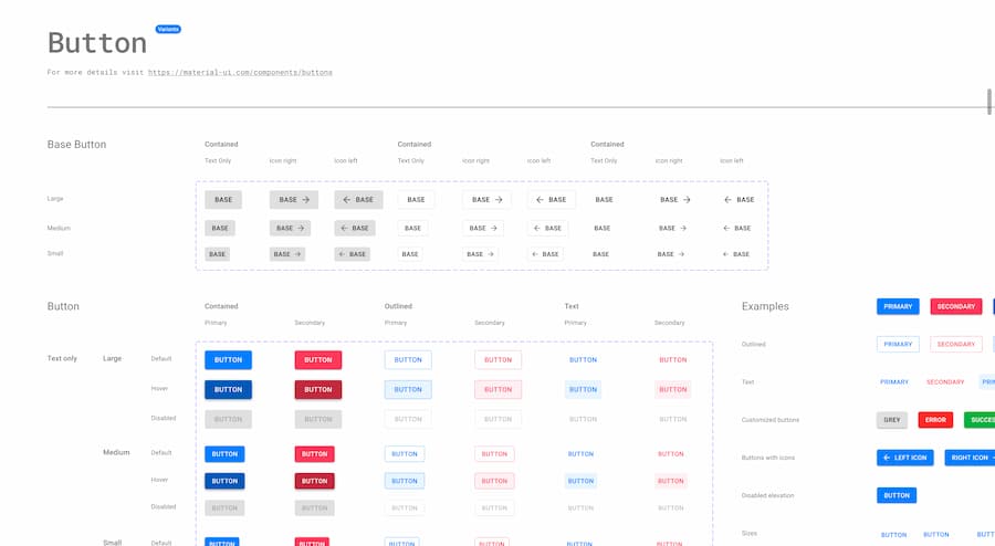
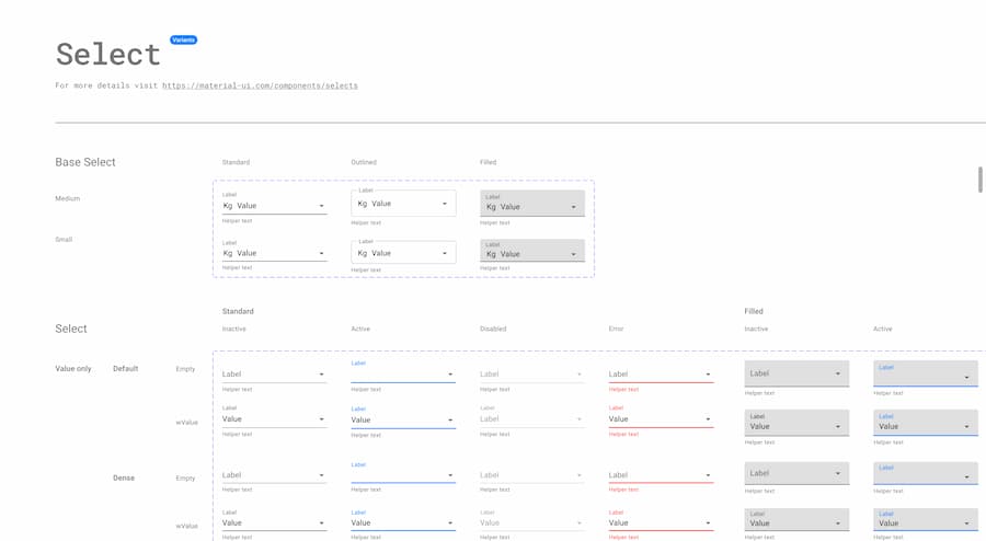
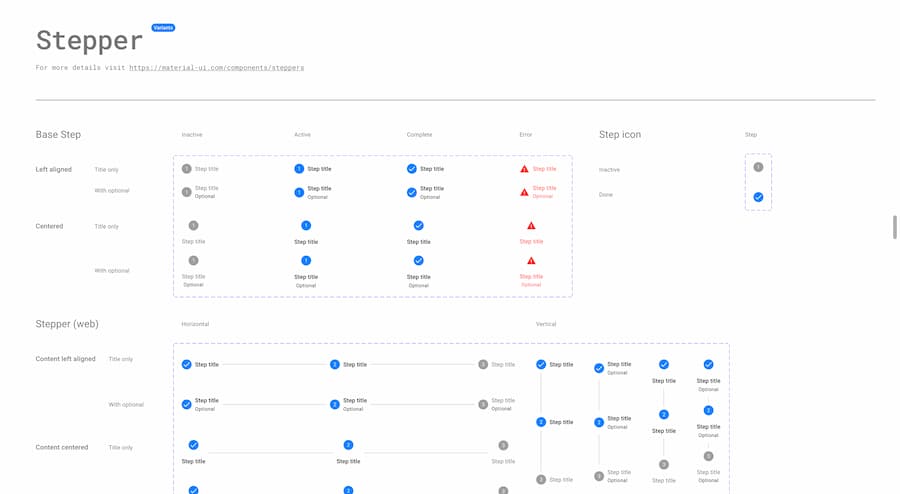
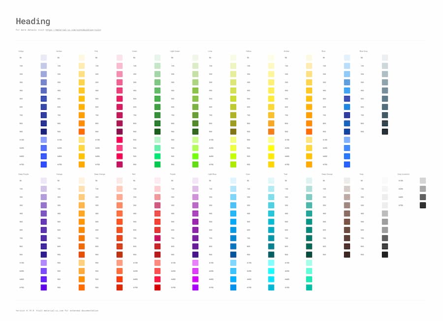
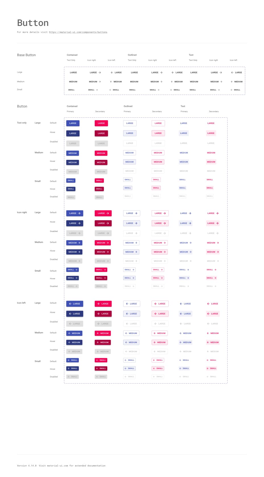
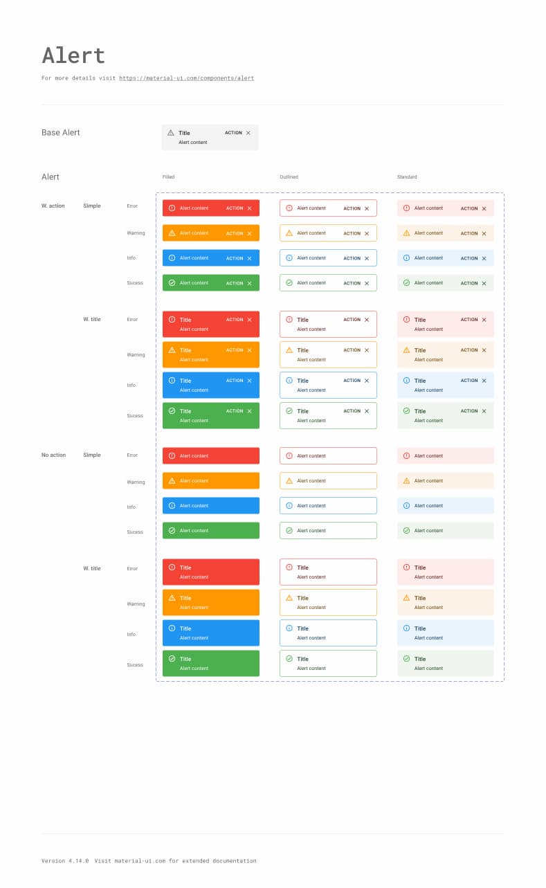
The Design Kits contain many of the Material UI components with states, variations, colors, typography, and icons.
Components
Branding
Iconography
Much more
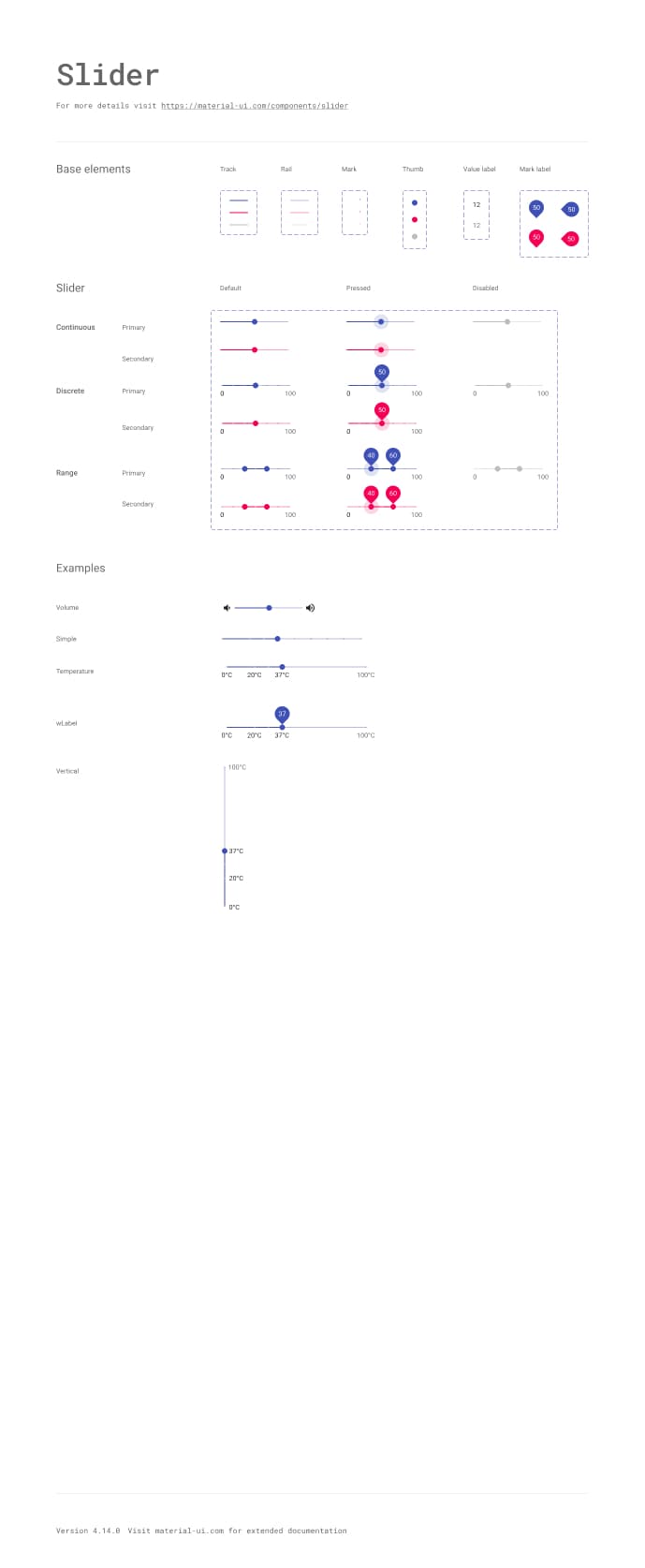
Material UI Button component variations in the Figma Design Kit.Material UI Alert component variations in the Figma Design Kit.Material UI Slider component variations in the Figma Design Kit.

Available in:

Figma logo.Sketch logo.Adobe XD logo.

We frequently update them to stay up-to-date with the latest release.


Available in Beta

The way developers and designers ship faster

The Sync plugin is perfect for designing and developing using the Material UI React library and Design Kit.
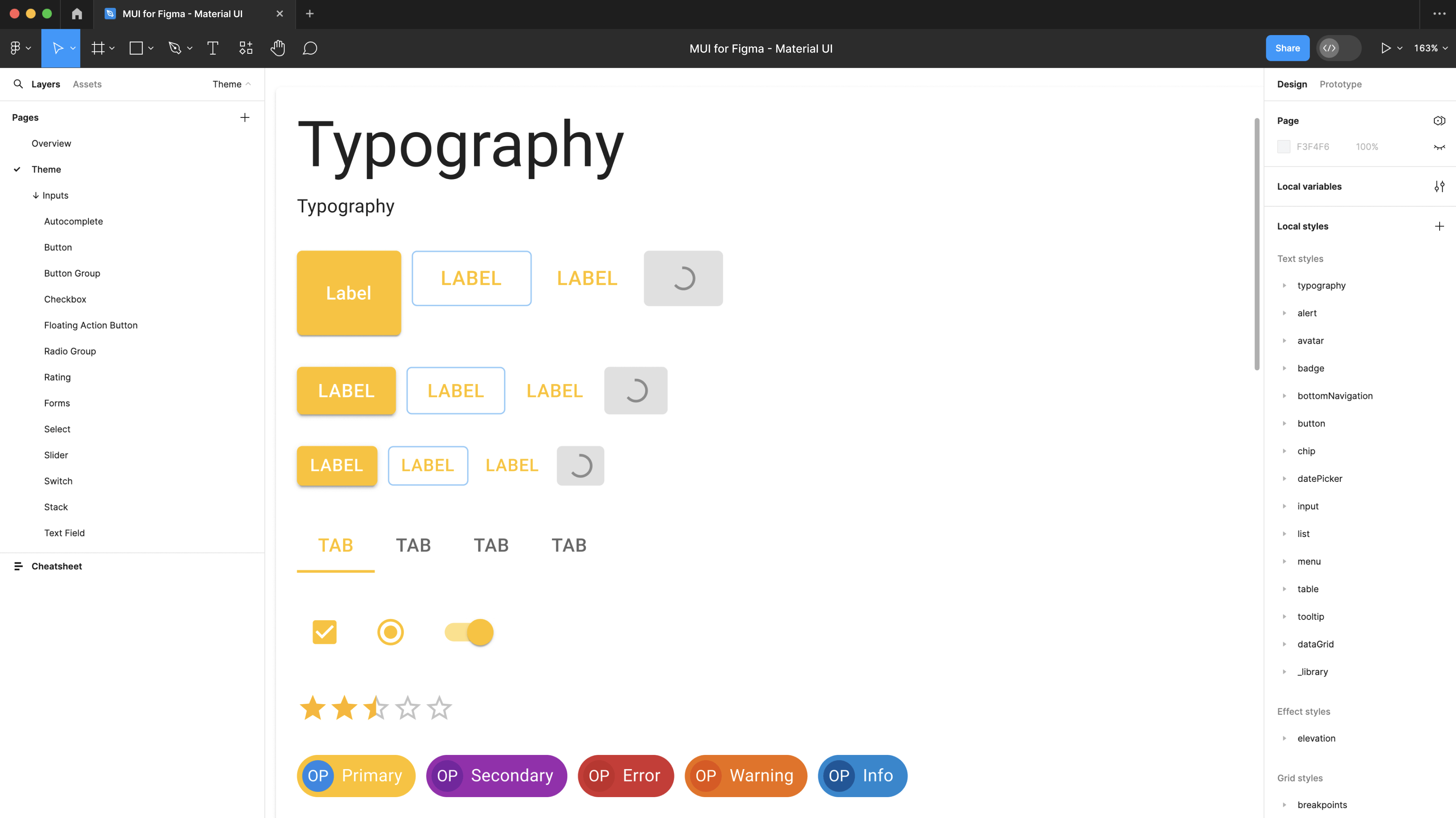
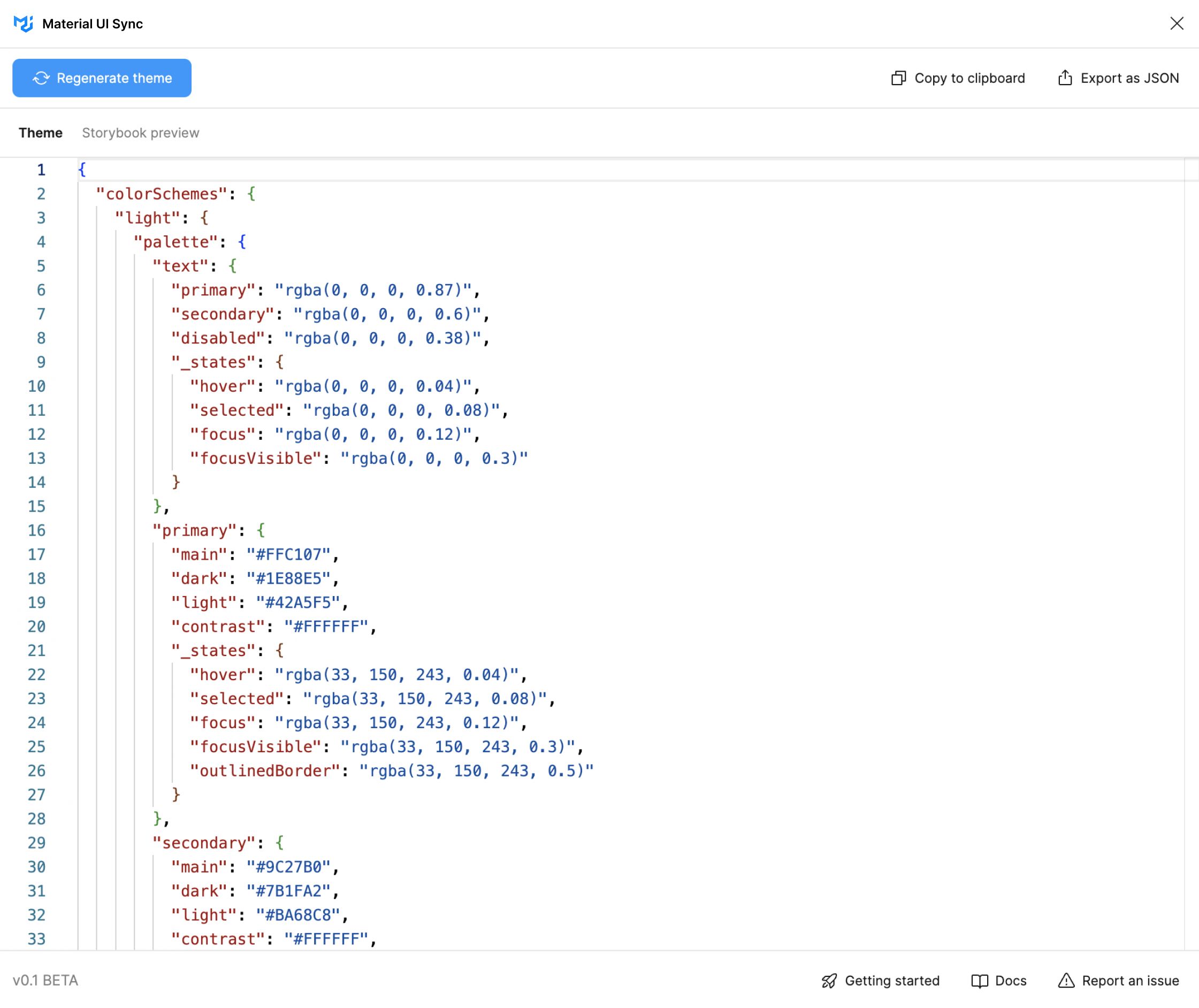
Theme customizationGenerate theme code with custom colors, typography styles, shadows, spacing values, and border-radius.
Component customizationFully customize a component's design across multiple states and then generate the corresponding theme code.
Preview your changes on StorybookQuickly visualize all the changes you run through Sync on a built-in Storybook preview instance.
The Material UI Design Kit for Figma.The Material UI Sync plugin displaying theme code.

Get the beta version of Material UI Sync now!

There's still a lot to do, and we're looking forward to hearing from all of you.


Frequently asked questions

We think you'll love the components we've built so far, but we're planning to release more. We opened it up as soon as we had something useful, so that you can start getting value from it right away, and we'll be adding new features and components based on our own ideas, and on suggestions from early access customers.
The number of licenses purchased must correspond to the maximum number of editors working concurrently in a 24 hour period. An editor is somebody contributing changes to the designed screens that use the Design Kits. No licenses are required for viewing the designs.
We'll send you an email when a new release is available. You can access the item on the download page of your store account and find a detailed description of the changes under the"Changelog" tab on this page.
No. We're still in alpha mode and rolling out more features progressively, as per your feedback. We might introduce paid tiers in the future, though.
Yes. We offer a 50% discount on all products licensed to students, instructors, non-profit, and charity entities. This special discount cannot be combined with any other type of discount. To qualify for the discount, you need to send us a document clearly indicating that you are a member of the respective institution. An email from your official account which bears your signature is sufficient in most cases. For more information on how to qualify for a discount, please contact sales.

Got any questions unanswered or need more help?

From community help to premium business support, we're here to help.

Contact sales

Community

Join our global community

Material UI wouldn't be possible without our global community of contributors. Join us today to get help when you need it, and lend a hand when you can.